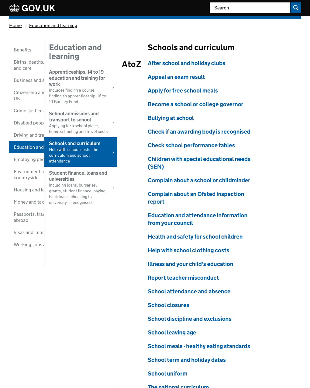
It was hard to find things on GOV.UK
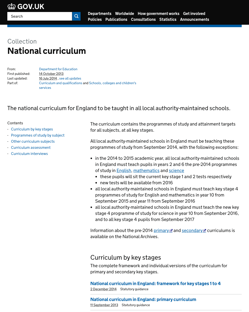
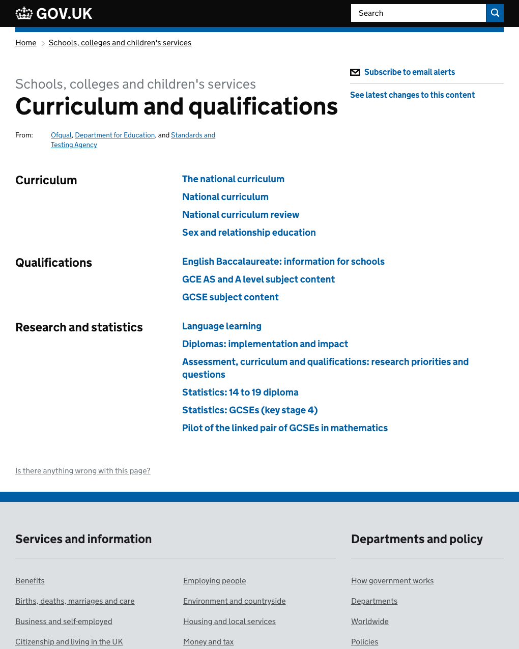
I started on the Finding Things team to look into this problem in March 2015. GOV.UK was actually 2 separate sites. ‘Mainstream’ was curated by GDS staff, and included core user needs, verified by user research. ‘Whitehall’ was where the departments and agencies would publish their content.
Various problems had been introduced because of having different publishing systems with different teams inputting content into them:
- each site had its own navigation
- they each used different ways to categorise content
- there were no links between content in the two different sites
There was also a set of issues they both suffered from:
- navigation was hard to understand
- page titles were unclear and repeated across multiple pieces of content
- there were a lot of navigational dead ends, where users would get lost without finding the answer they needed
- users could get lost in loops of links between content
Starting with the alpha
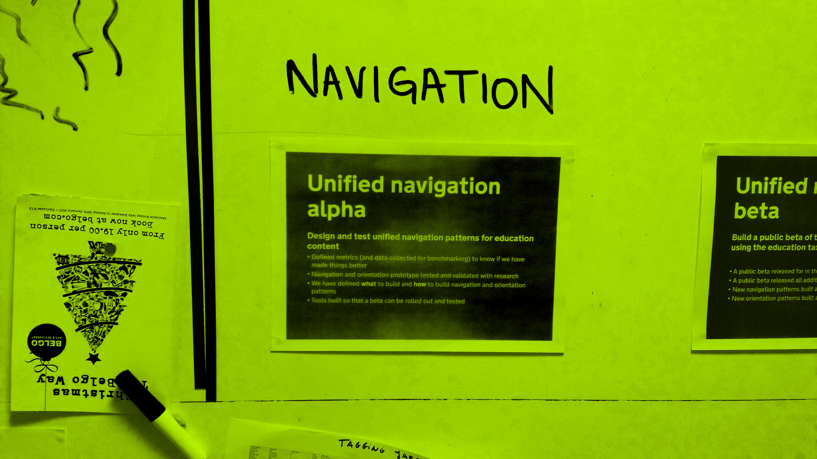
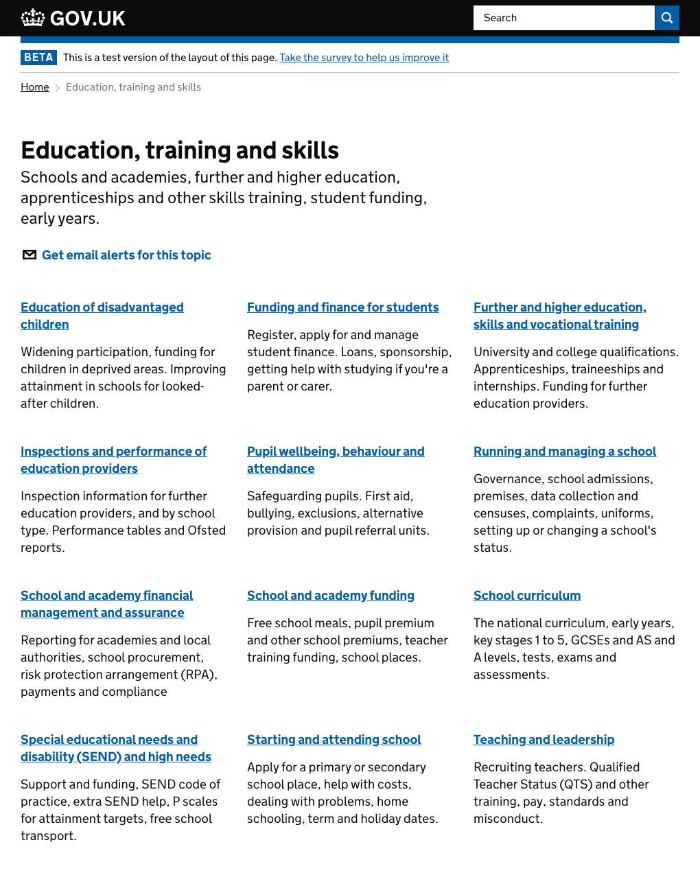
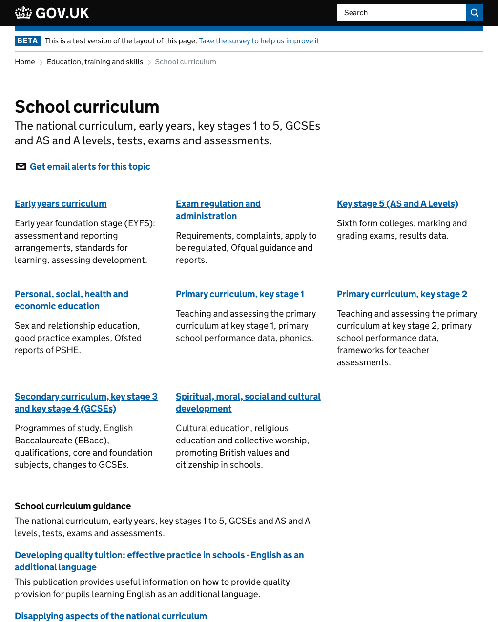
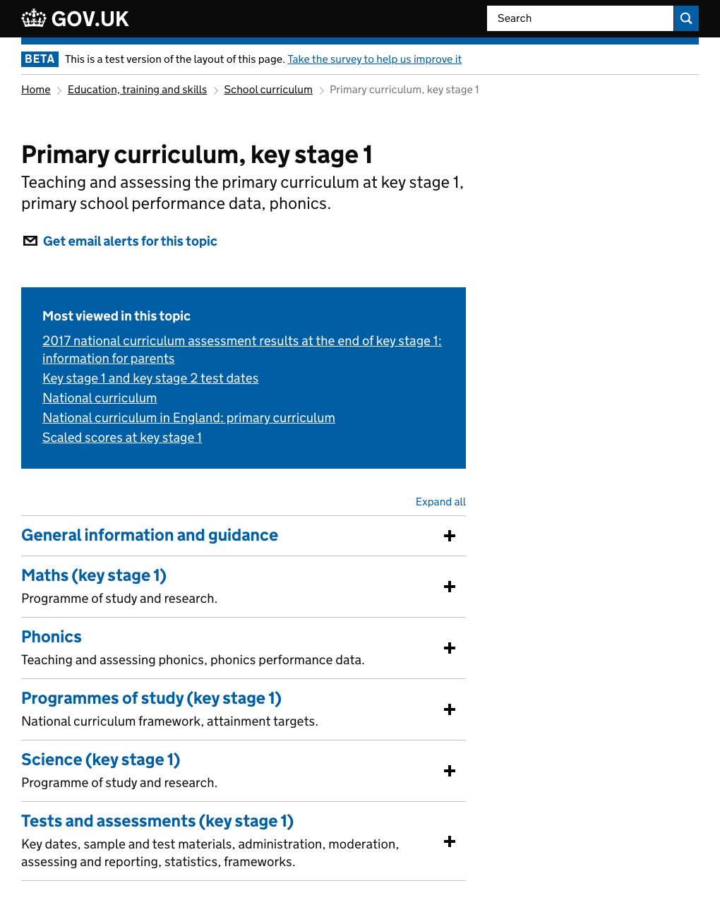
In order to keep the scope of our alpha manageable we chose one GOV.UK subject area, education, across Whitehall and Mainstream content. Then we could focus on building a single subject based taxonomy just for that, which we could then use across all content subjects once we felt we had something that worked.
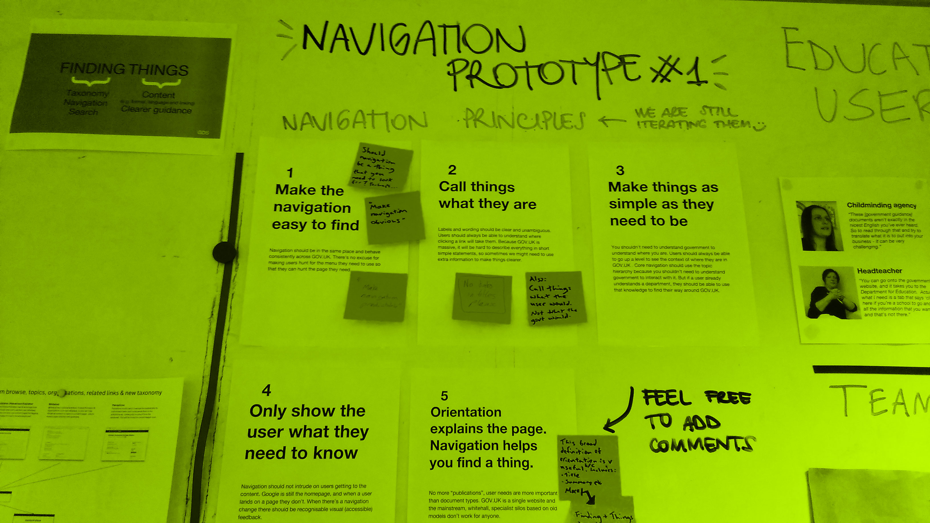
To create some focus and shared understanding for the whole team at the outset, I suggested we create some principles for redesigning the content navigation and led the workshop to come up with these. Together we came up with these principles:
- Make the navigation easy to find
- Call things what they are
- Make things as simple as they need to be
- Only show the user what they need to know
- Orientation explains the page. Navigation helps you find the thing.
We had weekly contextual research sessions, visiting education professionals across the country. We learnt how they used GOV.UK and other information sources.
We iterated the design of the navigation pages, using the feedback from our usability testing to iterate the taxonomy at the same time.
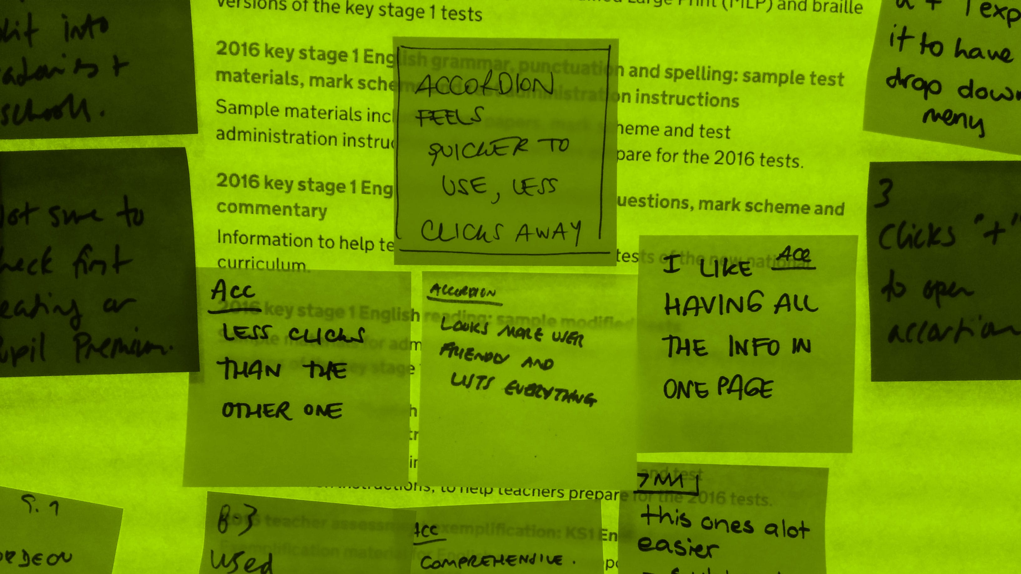
Our research uncovered some problems: there was too much similar content and the titles were confusing, too similar and hard to differentiate within a list.
Moving to beta
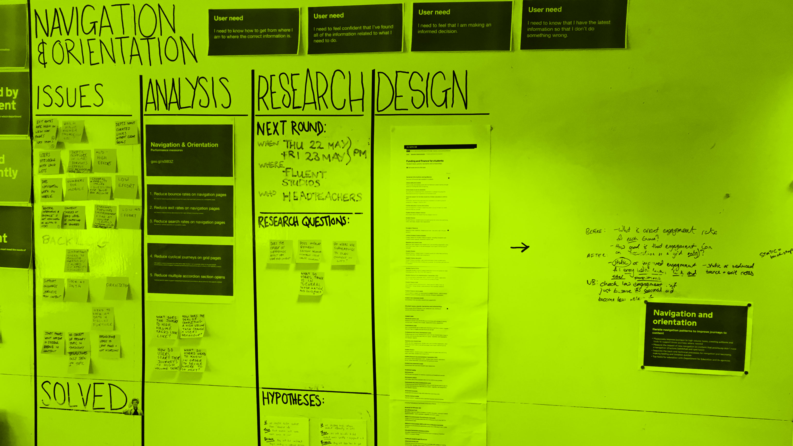
We built the designs from the alpha and set up an A/B testing framework to show the new designs to a percentage of users.
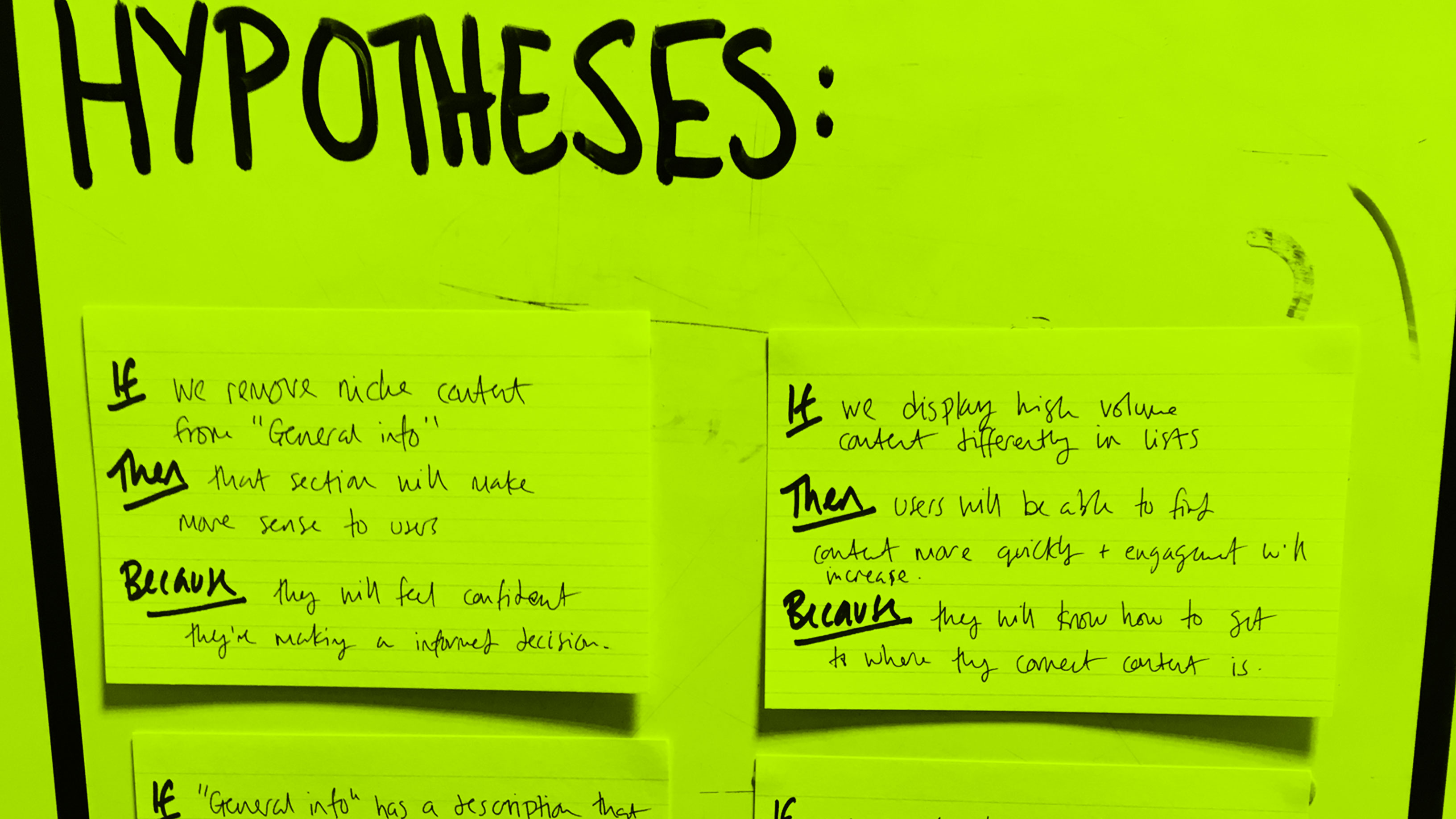
I set up a fortnightly sprint cycle and used the hypothesis driven design methodology to involve the team in identifying and prioritising issues, and suggestions hypothesis for how we might solve those issues.
What we learned
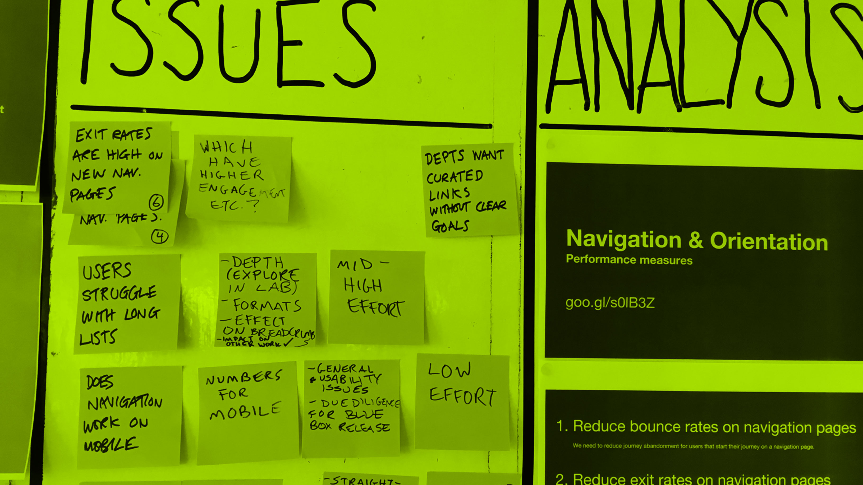
We tested the limits of our designs. Using metrics we found the optimum number of links for our patterns, but unfortunately learned these wouldn’t scale to other content formats. We needed to find a solution that could work across different types of content.
Users’ browsing and retrieval behaviours differ depending on the content format and we would need patterns that would meet those needs.
Our approach to the taxonomy didn’t scale. We learnt that in order to develop the taxonomy for the entire site we would need to automate the process rather than constructing the taxonomy by hand.
Our page templates weren’t consistent and needed unifying. Inconsistent legacy page layouts were stopping us from applying the navigation across all the content.
We couldn’t fix the navigation problems with design alone. It needed a multilateral approach including improving publishing tools and content strategy within departments, but that was out of the scope of our project.