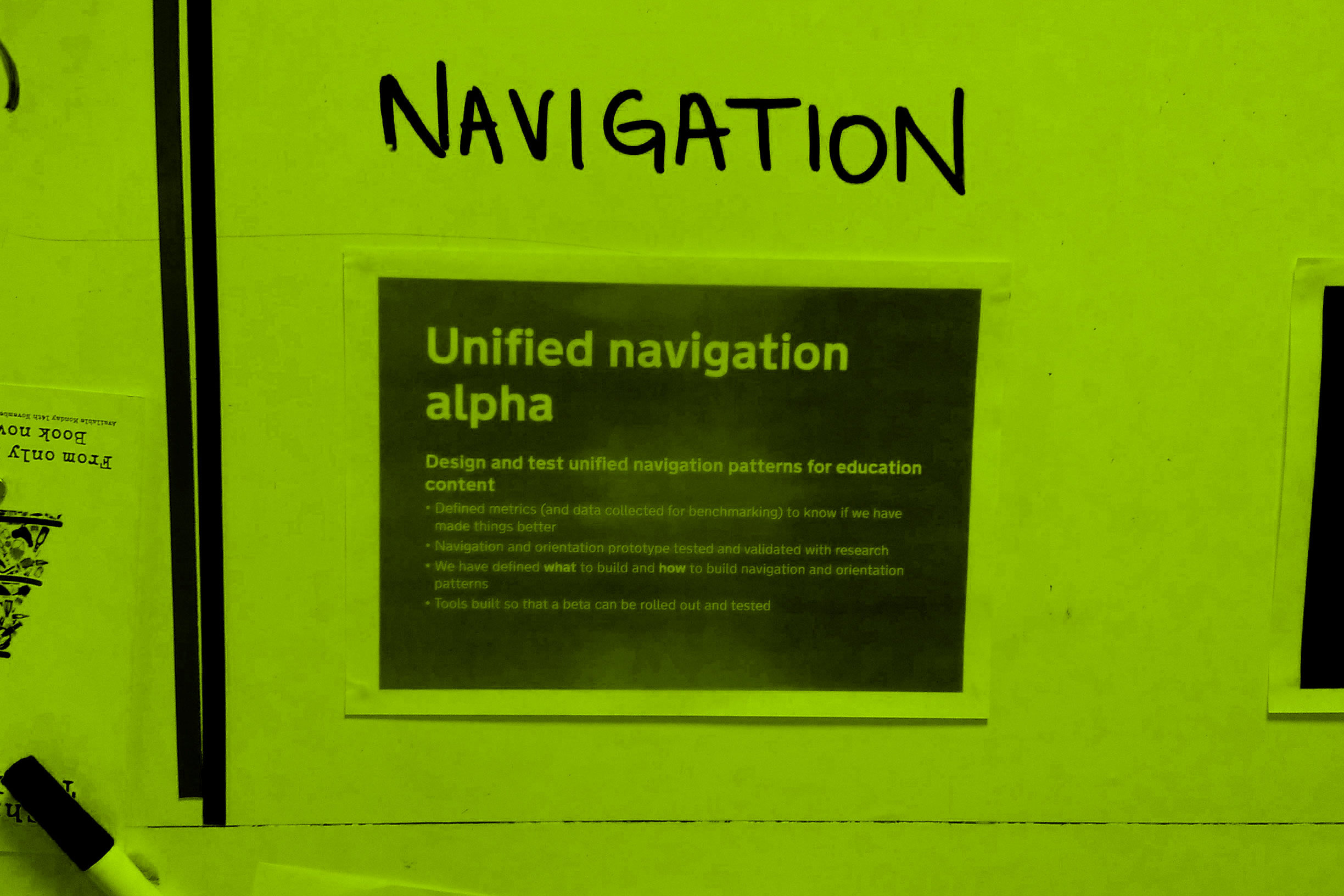
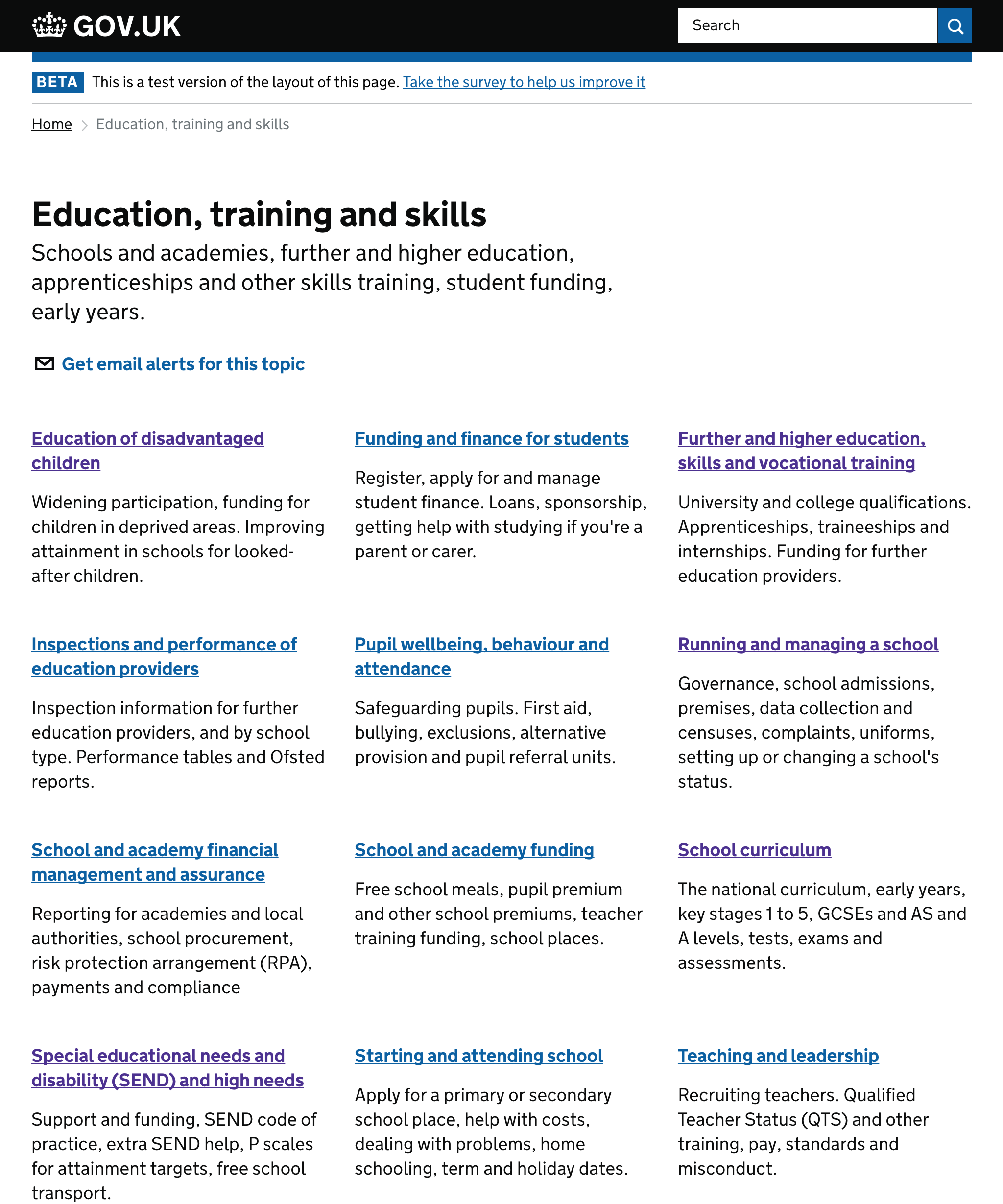
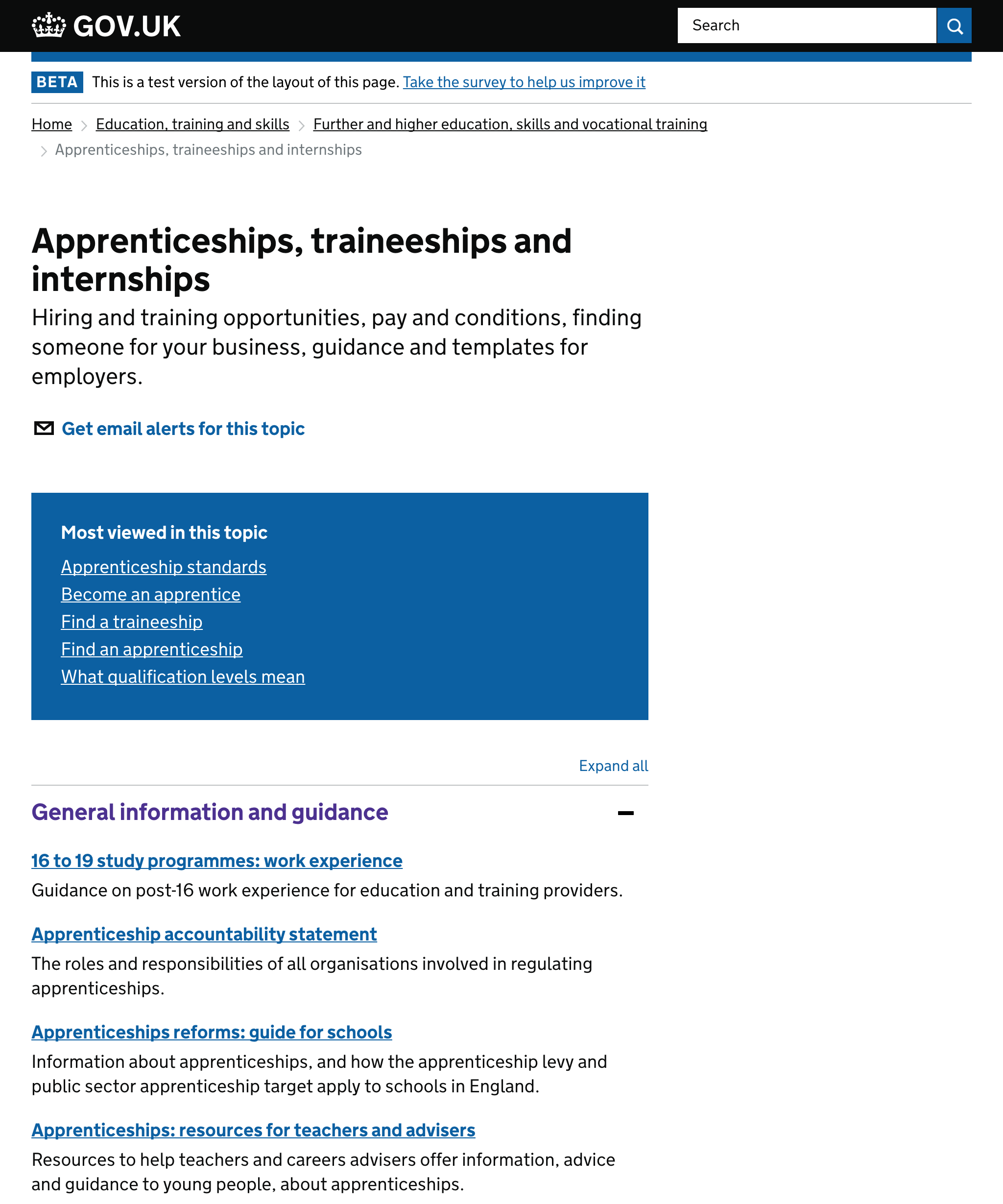
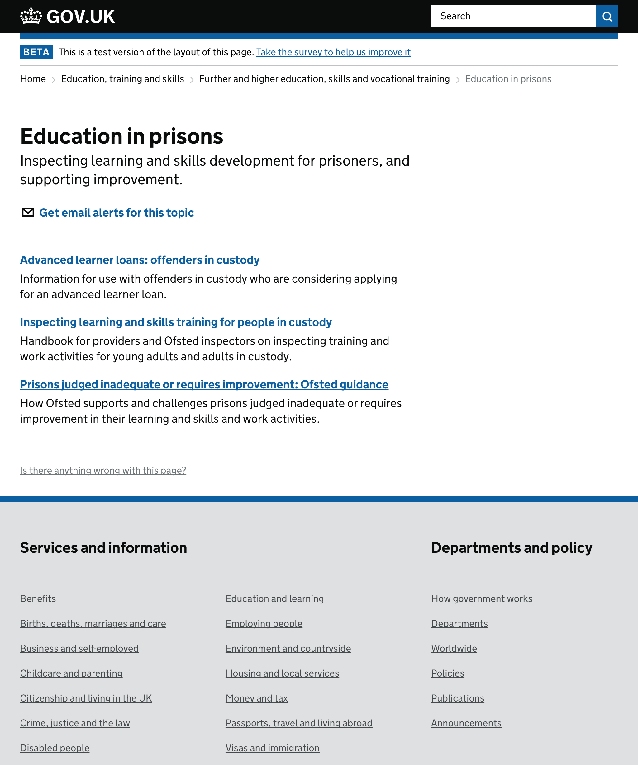
GOV.UK education navigation
GOV.UK had gone through massive growth, with over 320,000 content items, growing by more than 3,000 every month. Navigation was hard to understand. Page titles were unclear and repeated across multiple pieces of content. There were no links between Mainstream and Whitehall content. There were a lot of dead ends and looping navigation.
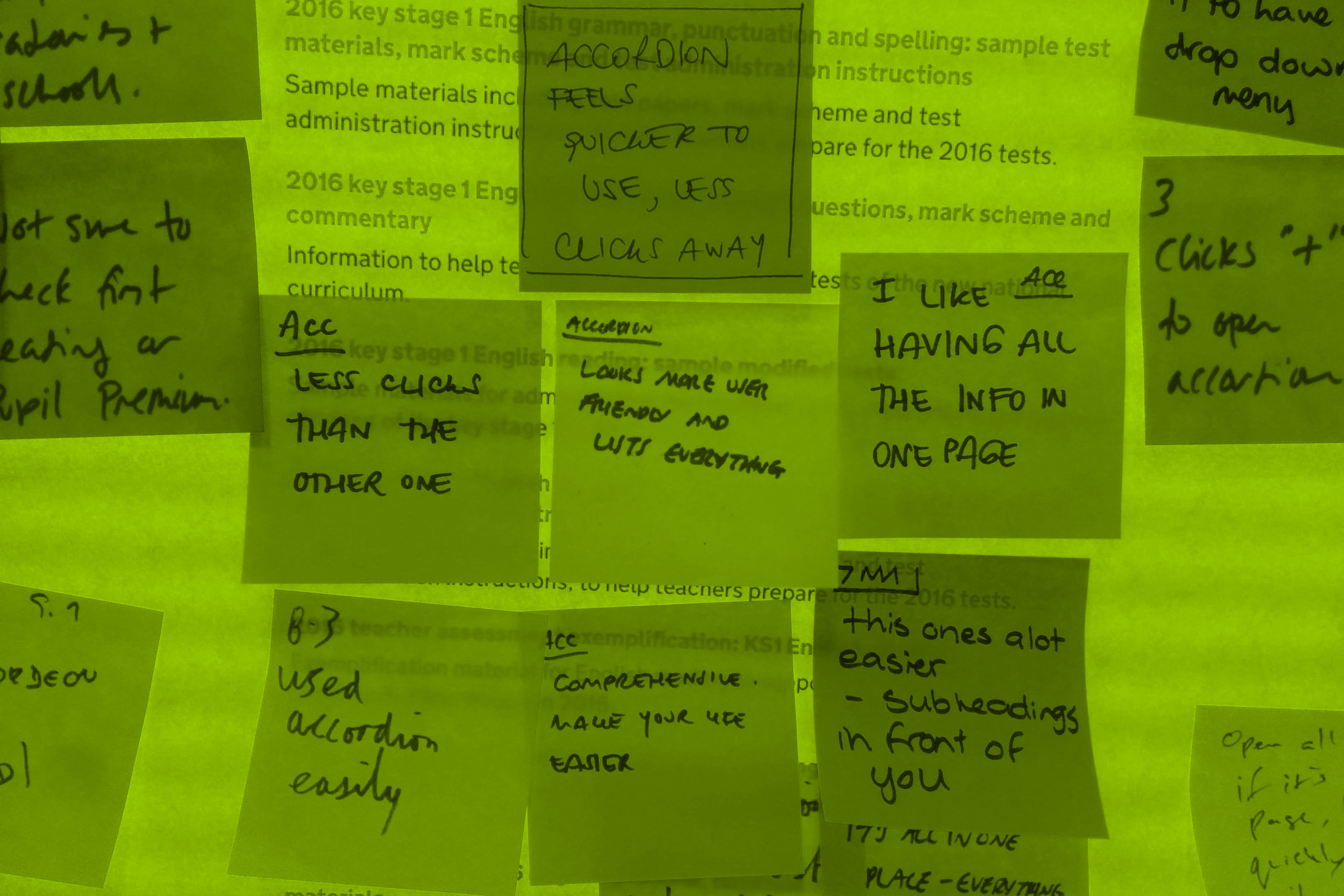
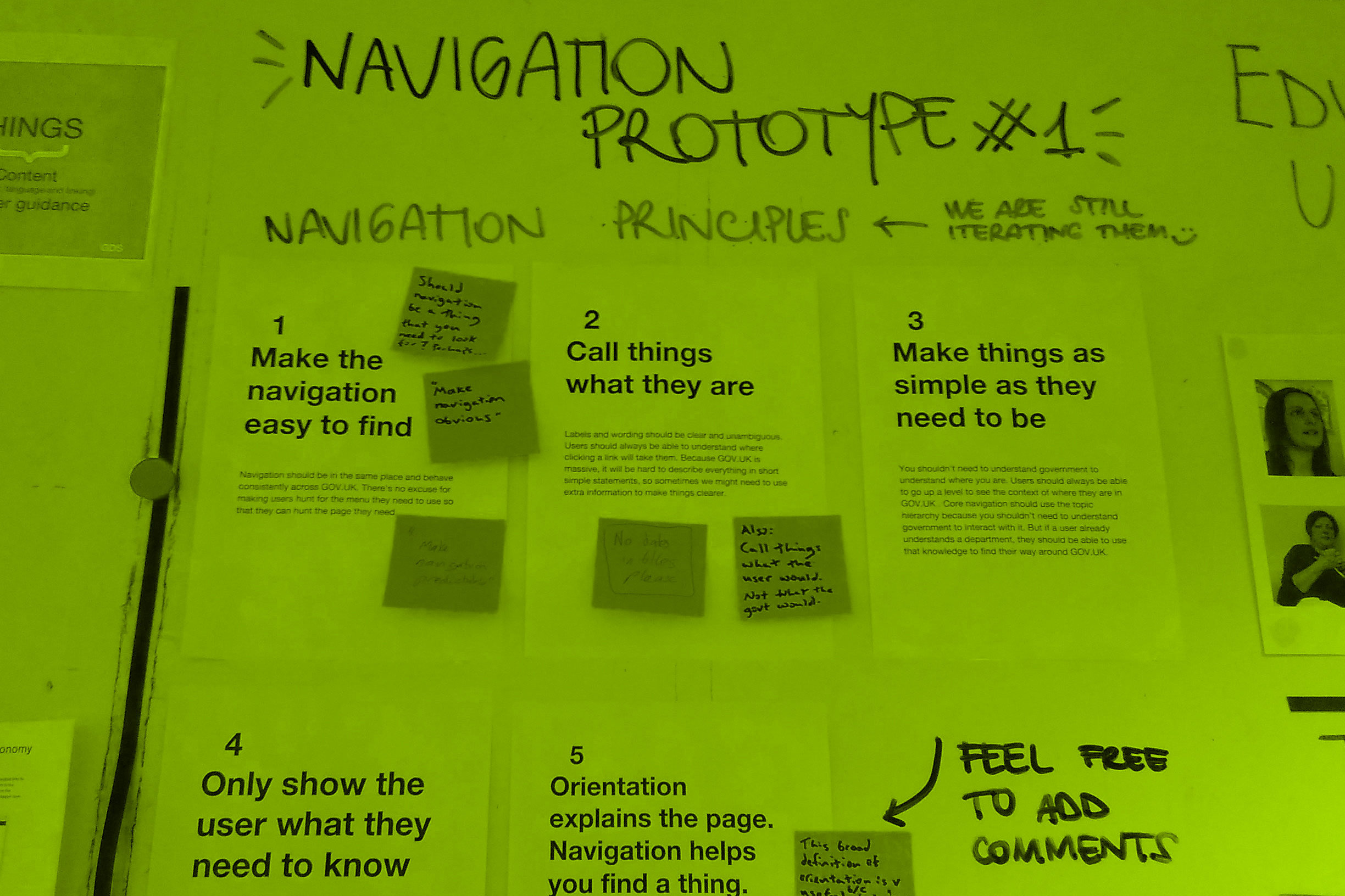
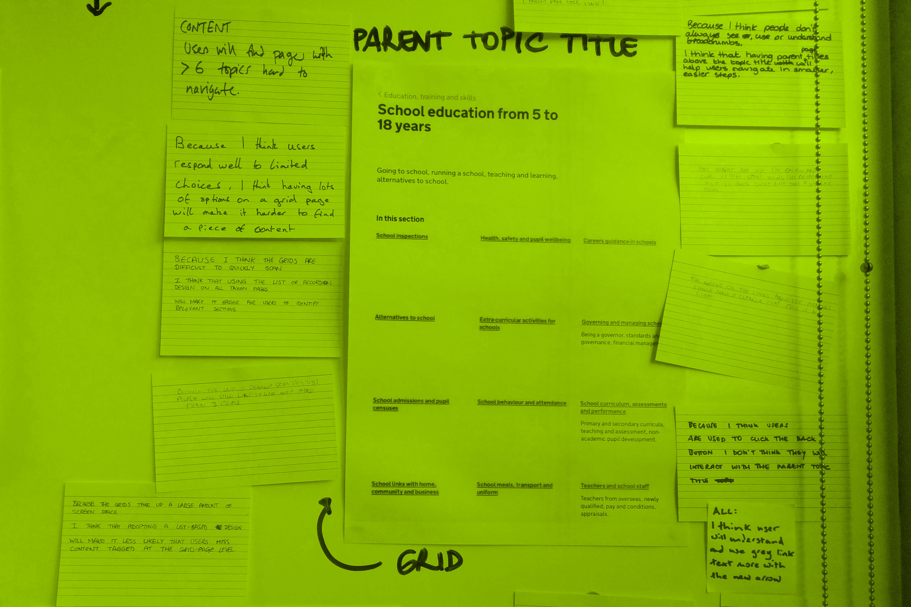
I looked at solving this problem through the alpha and beta and live phases. I created prototypes which were tested and iterated, using the hypothesis driven design methodology to involve the team in identifying and prioritising issues, and suggesting hypotheses for how we might solve those issues.